Pocket Watch Mobile App
A mobile app concept designed to improve management and tracking of finances.
Duration: December – January
Role: Product Designer
Tools: Figma
EXECUTIVE SUMMARY
Simple Fin-tech Solution
Pocket Watch is a concept mobile finance app designed to help people better understand their spending, budgets, and subscriptions in one place. I created this project as a product design case study to explore how financial data can be simplified without losing meaning. The work covers problem definition, competitive research, ideation, and high-fidelity designs.
Define the problem
Framed the core challenge around helping users understand their spending patterns and recurring expenses without dashboard overload.
Review competitors
Audited Mint, YNAB, and Wally to compare hierarchy, budgeting features, and UI design patterns.
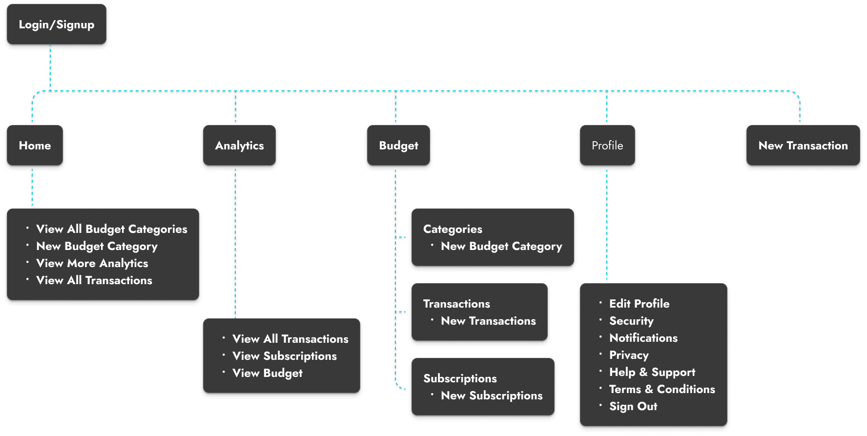
Map and structure
Planned out the user journey and put together wireframes to inform a simple and clear navigation through all of the app's features.
Design System
Developed foundational design system to support consistency and scalability of the application.
Design the interface
Translated the structure into polished screens with a consistent visual design system and clear application goals.
PROBLEM SPACE
Keeping track of personal finances is harder than it should be
I’ve personally struggled with staying aware of recurring expenses and understanding where my money was going month to month. Many finance apps try to do everything at once, which often results in cluttered dashboards and confusing experiences that make users disengage instead of feel in control.
COMPETITOR ANALYSIS
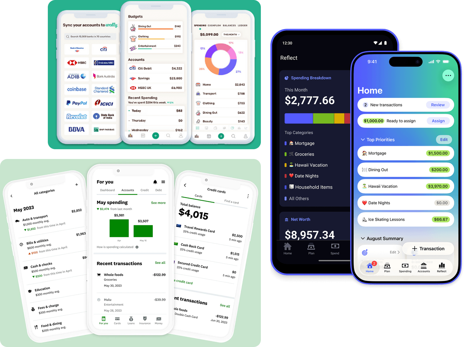
Reviewing existing market solutions
I reviewed several existing finance apps, including Mint, YNAB (You Need A Budget), and Wally. The goal was to see how these products present financial information, structure dashboards, and support budgeting behaviors. This process helped me identify component similarities and information hierarchy which shaped the direction of my design.
- Mint automatically connects to thousands of banks to pull and categorize transactions, provides bill reminders, credit score monitoring, and gives a broad overview of financial health.
- Wally combines automatic syncing with customizable budgets, multi-currency support, and receipt scanning to help users track spending and goals with flexibility and real-time insight.
- YNAB centers around proactive, zero-based budgeting that encourages users to assign every dollar a job and teaches disciplined spending through its philosophy and educational resources.
- Mint and YNAB are largely focused on automation and broad financial visibility and Wally blends automated tracking with goal-oriented tools.
IDEATION & PLANNING
User flow and wireframes
- Created initial user flow to plan out the different screens and interactions.
- Designed wireframes for layout reference.
DESIGN SYSTEM
Creating a scalable visual foundation
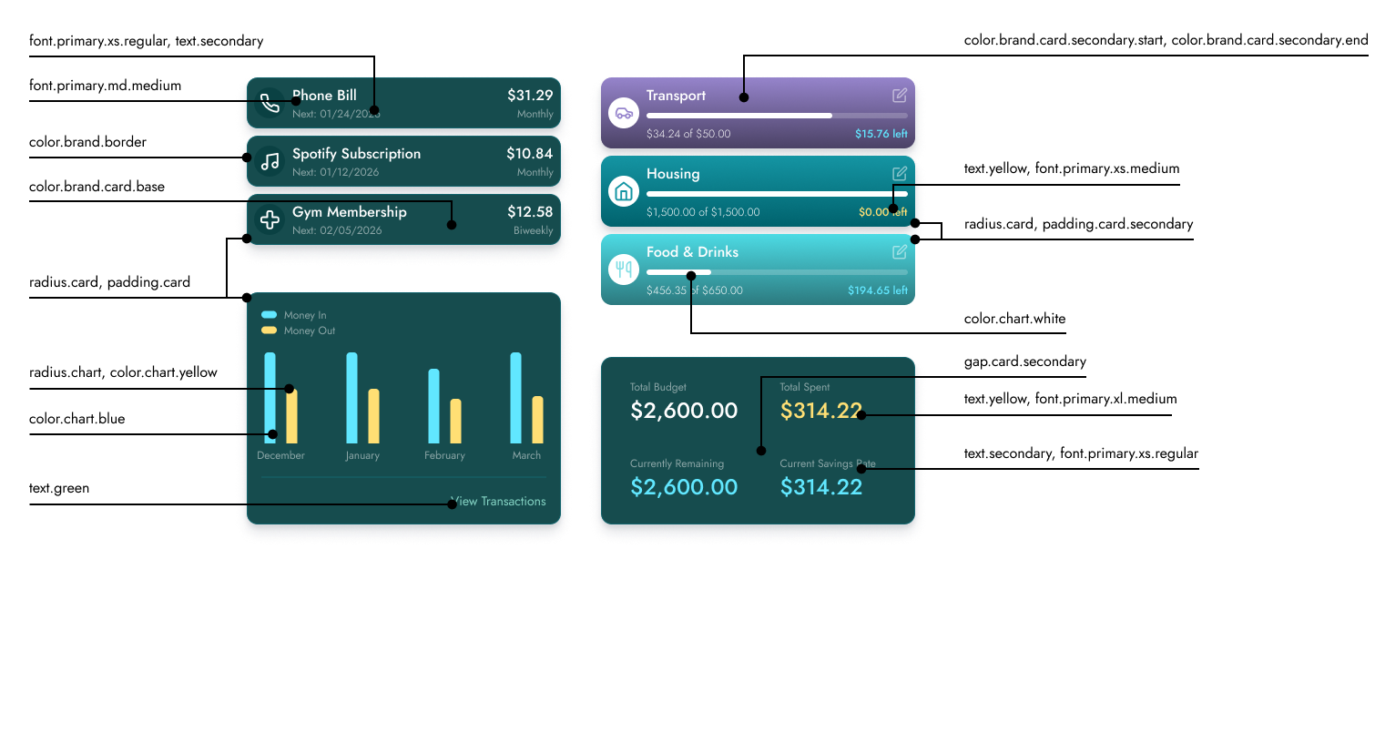
I built a lightweight system to keep the financial experience consistent across dashboards, charts, and transaction flows. The foundation combines a tokenized palette, a disciplined type scale, and predictable spacing rules so future features can be added without redesigning the core UI language.
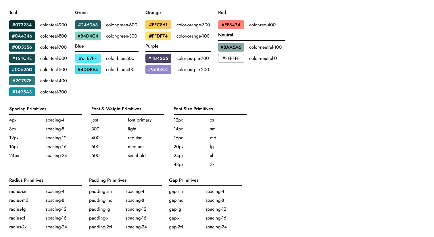
Primitives
Primitives define the foundational design tokens used throughout the interface. These include raw values for color, typography, spacing, and radius that ensure visual consistency before semantic meaning is applied.
- Color ramps across teal, blue, purple, orange, and neutral scales.
- Spacing primitives built on a 4px grid for layout, padding, and gaps.
- Typography primitives including the primary font, weights, and size scale.
- Radius primitives that standardize rounding across cards, charts, and controls.
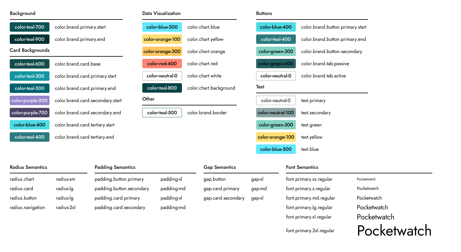
Semantic Tokens
Semantic tokens map primitive values to purposeful UI roles. This abstraction layer allows components to stay consistent even if the underlying primitives evolve.
- Role-based color assignments for backgrounds, cards, buttons, and charts.
- Text semantics defining primary, secondary, and status-based messaging.
- Layout semantics connecting padding, gaps, and radius to UI components.
- Standardized tokens for charts and data visualization elements.
Components
Components demonstrate how semantic tokens are applied within real interface patterns. Token annotations illustrate how typography, color, spacing, and radius combine to create consistent UI elements across the product.
- Financial cards displaying budgets, categories, and spending summaries.
- Chart components visualizing income and expenses across time.
- Transaction rows and subscription modules built from shared tokens.
- Annotated examples showing the relationship between tokens and UI elements.
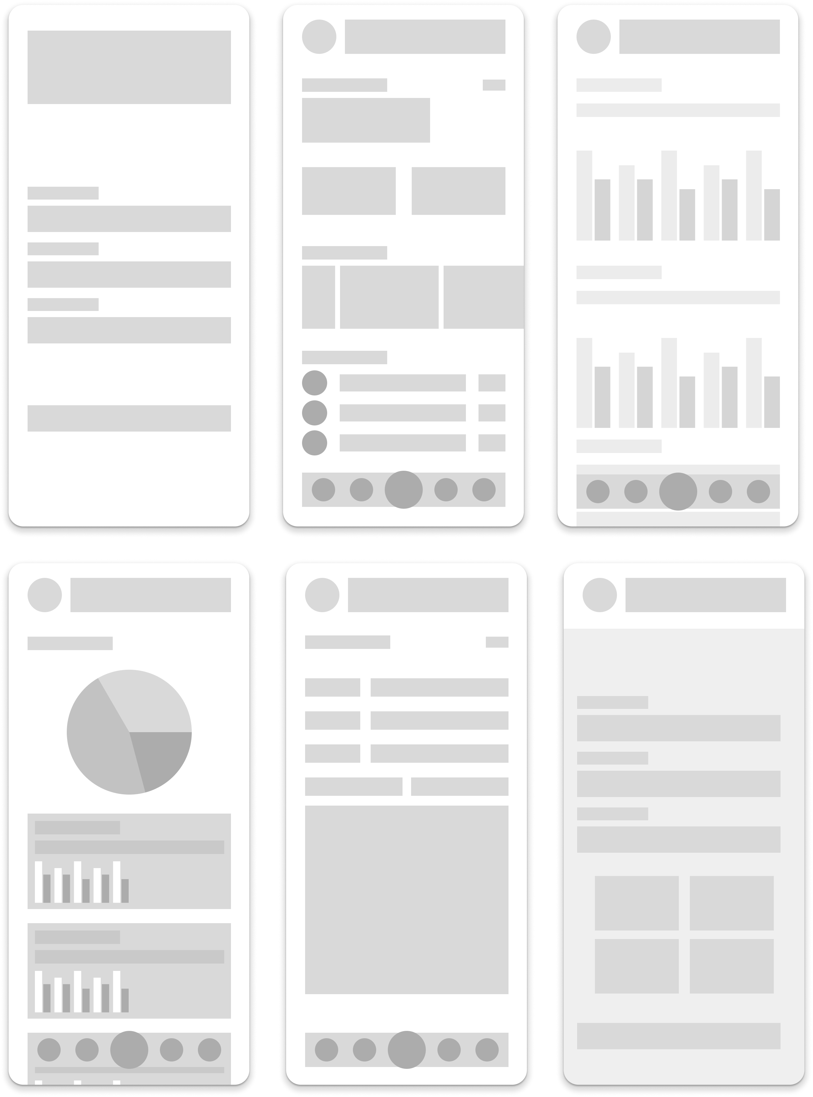
SOLUTION
System applied across the product
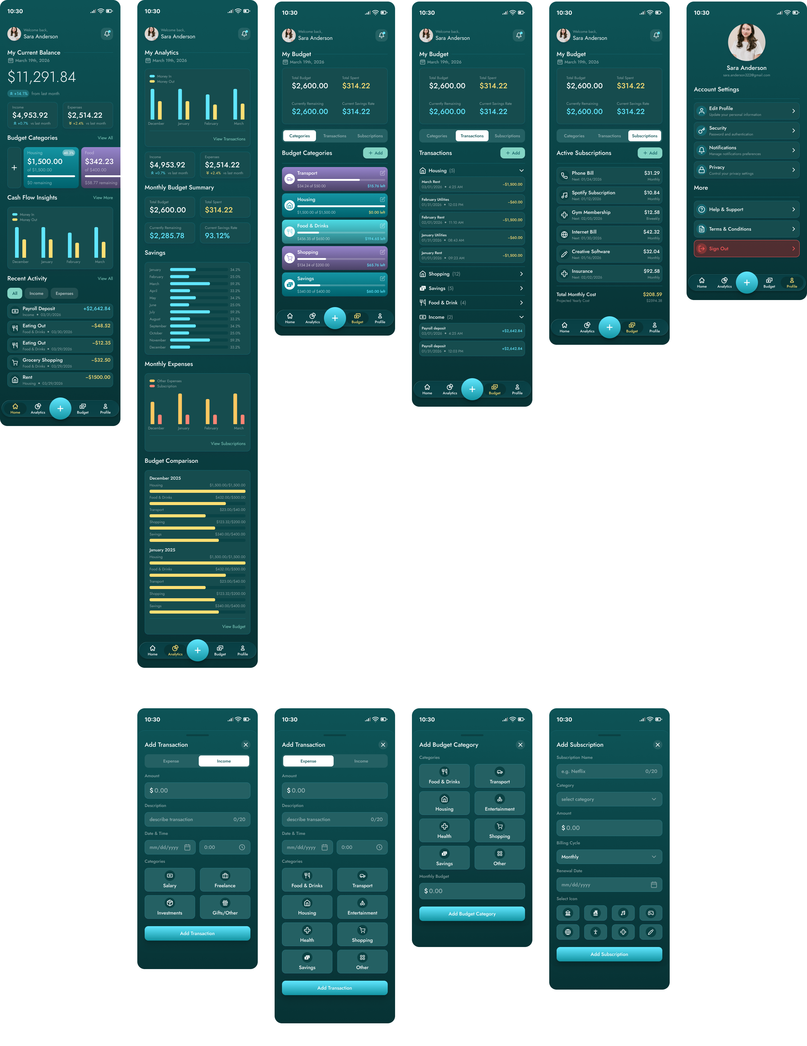
FINAL DESIGN
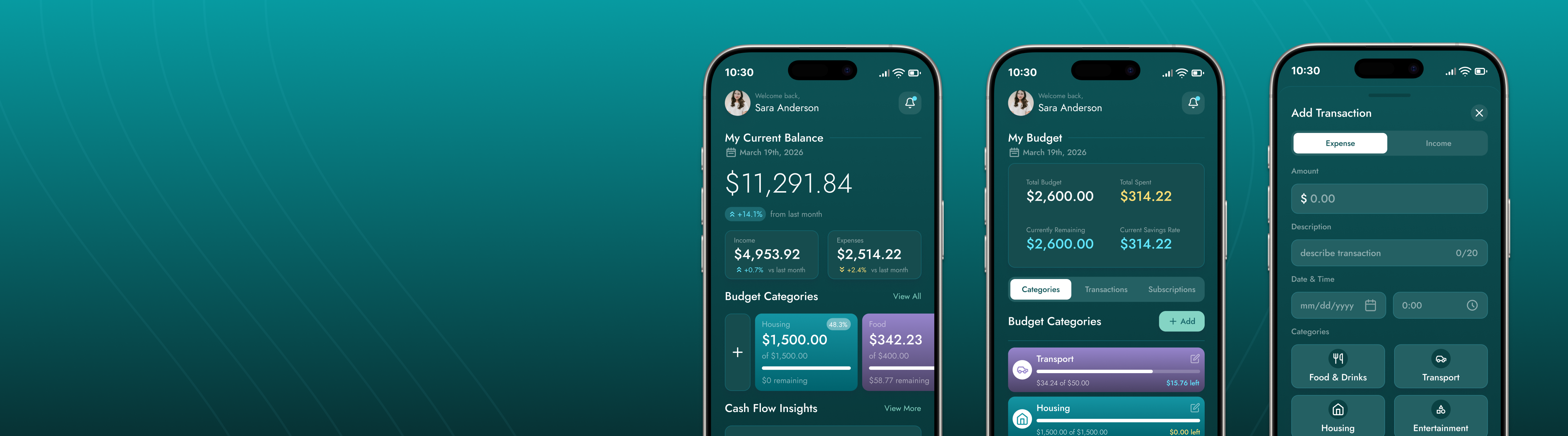
Pocket Watch offers control over your finances
Pocket Watch brings key financial information into a single, focused experience. The design emphasizes clear hierarchy, modern navigation, and visual feedback that helps users quickly understand their financial situation. Rather than overwhelming users with raw data, the design highlights what matters most.
REFLECTION
Key Takeaways
- Strengthened product thinking: This project enhanced my ability to prioritize and present complex, data-heavy information clearly, balancing user needs with business goals.
- Designing for real user behavior: I was reminded that effective interfaces are shaped by users interaction, emphasizing the value of problem definition and feedback ideation.
- Consistency and design systems: Following a design system reinforced the importance of maintaining visual and functional consistency, ensuring scalability and a cohesive user experience.